Pivot Tables are one of the most powerful features that is mostly known in Excel. However, Google Sheets is becoming more and more popular. Google Sheets is very similar with Excel from many point of views and of course it has the very popular Pivot Table.
If you want to learn more about Pivot Tables in Excel, find all the related posts in the Excel category.
Case Study
Amanda is a teacher and wants to keep track of the grades of her students in a Google Sheet. With every test, she writes a line with the test date, student name, subject and grade. Closer to the end of the year, she wants to see how the grades evolved from one month to another for each student and for the entire class. This is something that she can show parents during the Teacher-Parent conference
For the example below, we only have data for two students and two subjects for simplicity. The power of the Pivot Table is seen when the data set contains 25-30 students and 5-10 subjects. Grades are from 2 to 5 and are randomized.
The data set
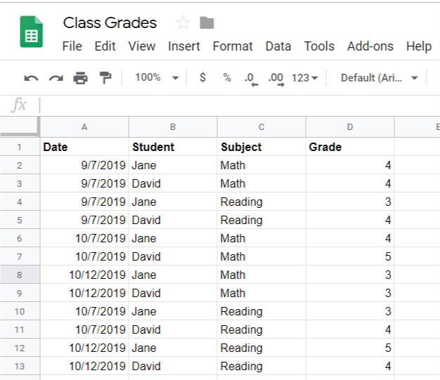
Here is a preview of this dataset. As you can see, some months have more than one grade for the same Subject and Student. So when we summarize, we will do the average of those grades
What is a Pivot Table?
A pivot table is a summary table. Google Sheets will summarize all the records in rows and columns to show the average of the student’s grades.
Insert a Pivot Table
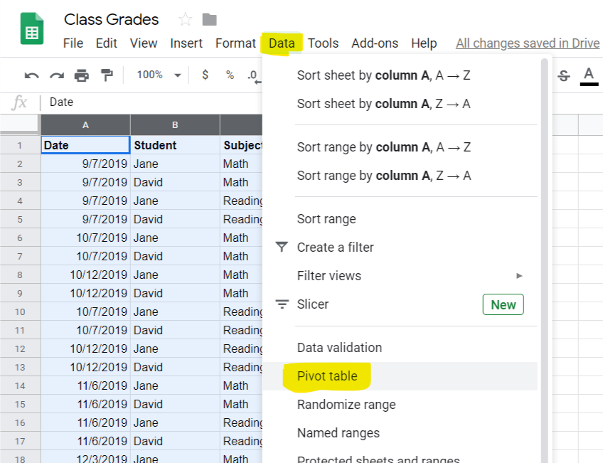
To insert a Pivot Table, select all the columns containing data in your dataset by clicking on the column header and dragging your mouse with the button pressed all the way to the last column containing data. In our case, select column A to D.
Go to Data – Pivot Table
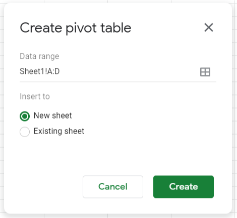
Google Sheets will suggest to summarize data in your column A to D (your selection) and to place it in a new Sheet. Click Create to move forward.
In a new Sheet you will get this screen. On the left, you will have your Pivot Table. On the right, you have the selection menu where you can select the elements of your Pivot Table using the Add Buttons.
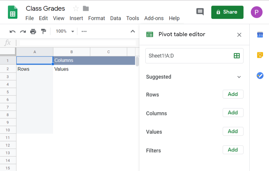
We want to show each student in a row so pick Student for the Row
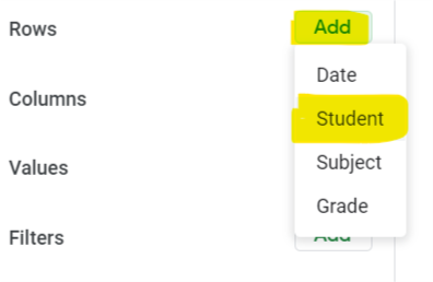
Notice you Pivot Table updated with the student names on the rows. Also notice how there is a blank row with now data. that is because we selected our data-set to be the entire section in columns A to D including the blanks. This was on purpose so that you can keep adding data and your pivot table will update automatically.
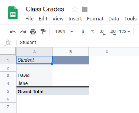
To filter out that blank row before we move further click on Filter and add the Student field to the filter.
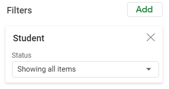
Click on the drop-down where it says “Showing all items” and select filter by condition. From the next dropdown select “is not empty”
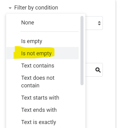
This will make sure that it will only show you the cells containing data from your dataset and you don’t have to keep changing the source of the data once you add new records
Next select in Values the field Grade. And change the Summarize by “Sum” to Summarize by “Average”
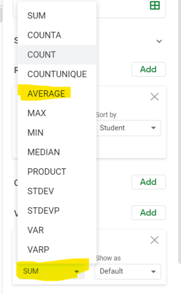
Next Add Date to the Column’s field
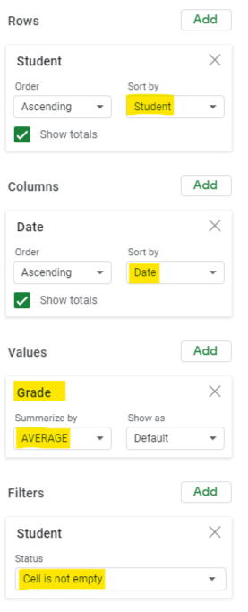
Your selection boxes should now look like this.
- Rows: Student
- Columns: Date
- Values: Grade (summarized by average)
- Filter: Cell is not empty
Your Pivot Table would look like this.

Notice that since we have two entries for the same subject and the same student in October, we have two columns for October. Since we added Date for the Column section, Google Sheets will show one column for each individual date. To fix that and have an average of those grades for the month of October, right-click on one of those dates, click on “Create Pivot Date Group” and select “Year-Month”
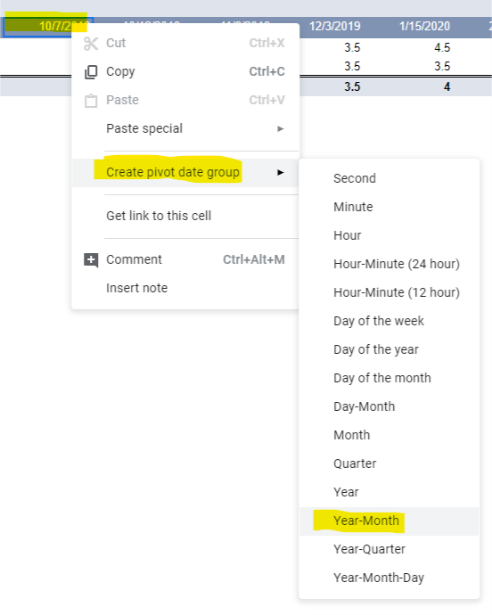
Notice how Google Sheets grouped the two values in October and average them out.

And that is all. Keep adding data entries as your year progresses and your pivot table will do all the calculations and show you the averages per month as the year progresses. In the first few months you’ll only have a few columns for the month but as the school year goes on, the new columns will be picked from your dataset. And if you set it up like in this example by picking the entire column and filtering out the blanks, you do not have to do a thing to the pivot table for the rest of the year. Of course, if you keep following my tutorials, you’ll learn so many new cool things to do that you’ll want to 😊
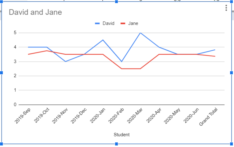
Next thing to do is to click Insert Chart and to show the progress of these students. Get that Teacher-Parent Conference started.
If you found this helpful, share with your colleagues.
