In the previous tutorials for Pivot Tables we looked at the simple Pivot tables with one row and one column, then we added a category to the data-set to create a multi-row pivot table. In this tutorial we will use one of the existing columns in our data set, the column “Date” to build on the pivot table we created in the previous step and add columns.
Note: If you are a Google Sheets user, Pivot Tables in Google Sheets work very similar.
Initial Data Set and Pivot Table
This is a simple Pivot Table with one Value for Rows and one Value for Columns (Total)

Multi-Row Pivot Table
This is where we added a category and created a multi-row pivot table with one column (Total)

Adding a Column
For this example, our data-set grew now to one record per day for each type of product. It contains sales for an entire year (365 records for apples, oranges, cucumbers and broccoli). There are a total of 1464 rows now.
You can see now the power of Pivot Tables. This next example will show you how to summarize 1 year worth of data in seconds. We’ll summarize sales data by Product and Category and we’ll see dales by month for each of those.
To create a pivot table, click anywhere on the data and go to Insert Pivot Table
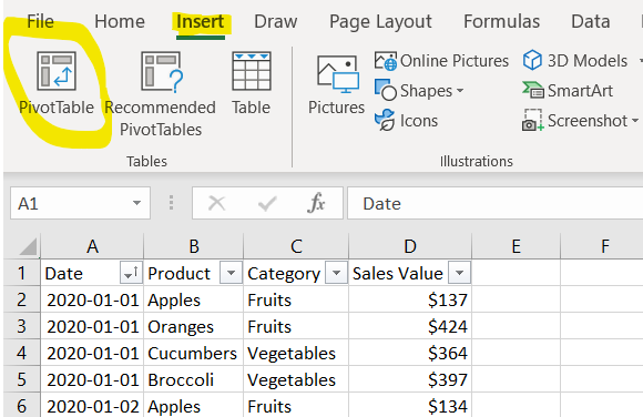
Excel will detect the size of the dataset and will suggest to place the pivot table into a new sheet. Click OK
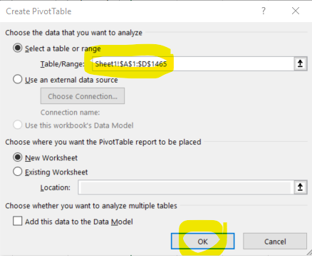
Once the pivot table sheet is created, just like in the previous example, drag the Category and the Product to the Rows section and the Sales Value to the Values section to get the same Multi-Row pivot table we did in the previous example.

Next we want to add a column. We will add the Date to the Column section by dragging the field. Because Excel detects that this is a Date field and that there are way too many records (365 days) to show them all summarized, it will group the values by Month and create an additional field called month
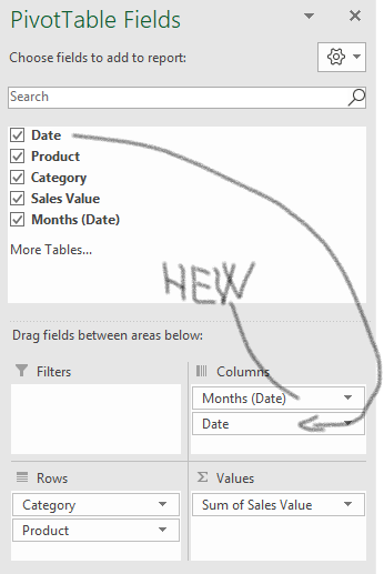
And there is your summary

Because these are sales and they look better in a currency format, click on the Field Sum of Sales Value and then click on Value Field Settings

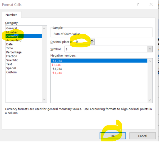
Next, click on the Number Format to format the numbers displayed into Currency.
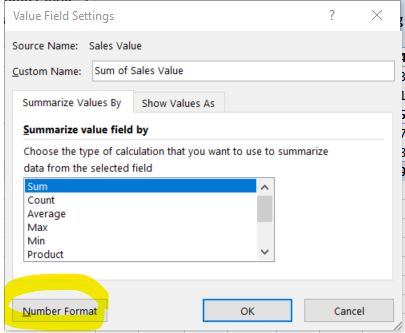
Change to Currency, bring the decimal places to zero and click OK
Now your summary looks better

To quickly chart this summary, press F11 on your keyboard.
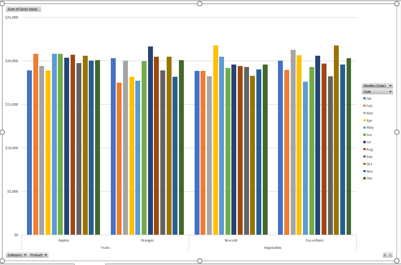
And that’s it. This concludes the basic Pivot Table tutorial.
If this was helpful, share.
